
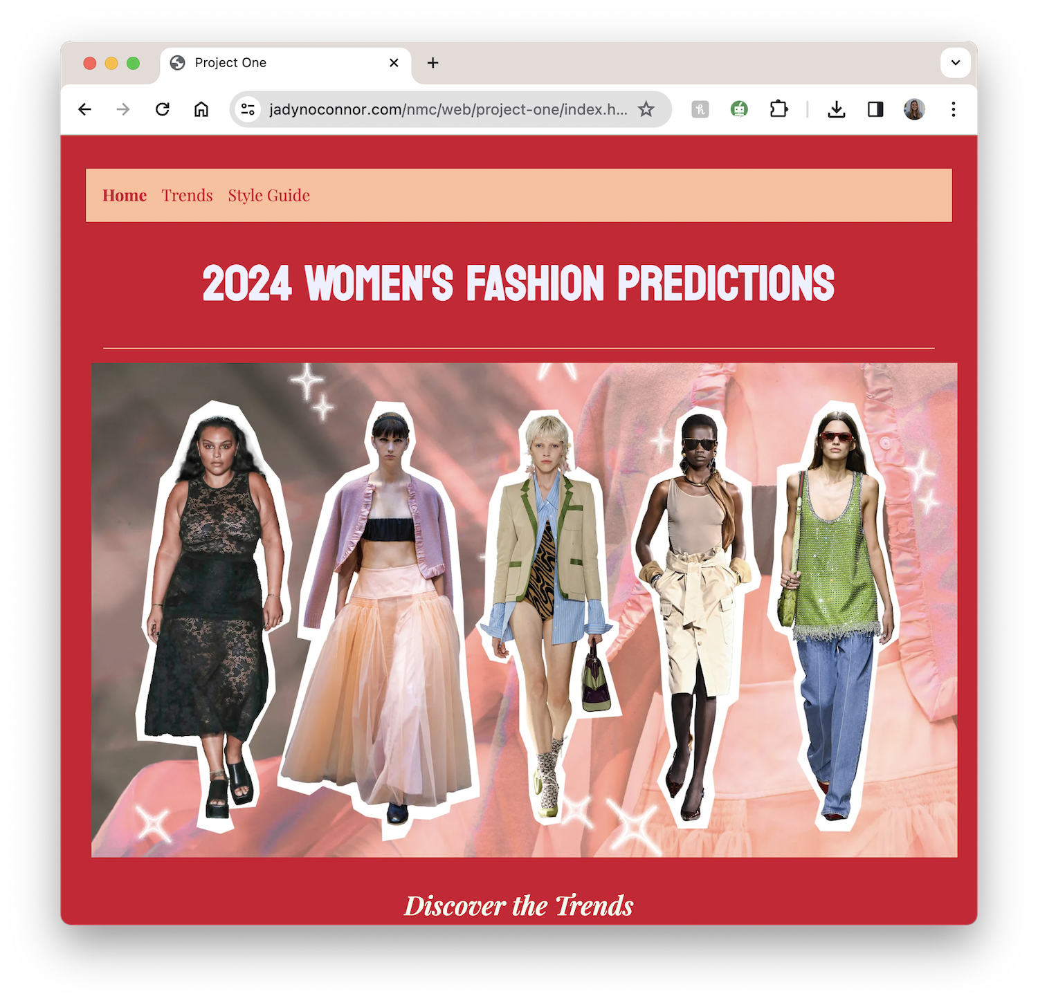
Artisanal Hand-Crafted Website
A three-page website about women’s fashion, built entirely with my hands using HTML and CSS.
Project Overview
This was my first project in web development, where I learned the fun and the not-so fun parts scripting a web page using languages, HTML and CSS. Before beginning this project, I had no previous knowledge in coding, but I was excited to learn. I utilized resources like Free Code Camp and YouTube videos in order to really grasp the basic foundations of HTML. My goal for this project was to create something I was proud of, and it’s fair to say, I’m happy with the end result.
Challenges I Faced:
Because this was my first experience coding, there were most certainly challenges to overcome.
- I struggled with aligning images that had different proportions in a way that looked cohesive together. With the help of Free Code Camp, I was able to see the importance of padding and border.
- I couldn’t figure out how to add the hover selector to my header text and shape it so it looked how I wanted it too.
- Every time I’d edit the background of my header, it was either too small or too big. After googling and looking around on Free Code Camp, I found my error and was able to fix it.
What I’m Proud of:
It wasn’t all bad. I really am proud of my first website.
- The overall aesthetic and look of my website.
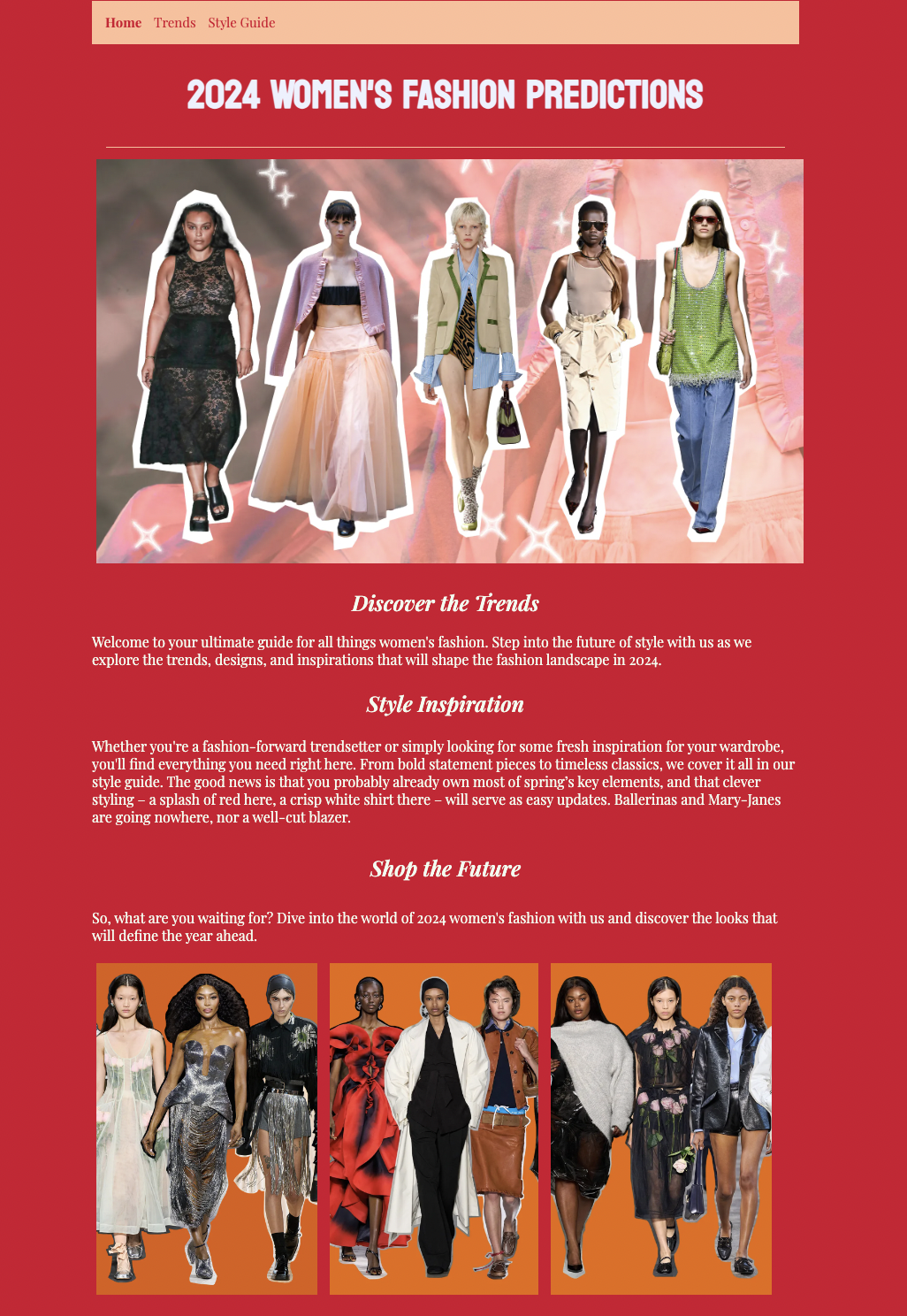
- How I was able to arrange the images on my style inspiration page to look clean and cohesive after struggling for a good amount of time to fix them.
- The qualitative elements I added such as italicizing words, adding captions, lists, and fonts.
- While it is simple, the easiness to navigate between each page.
Let’s walk through the process
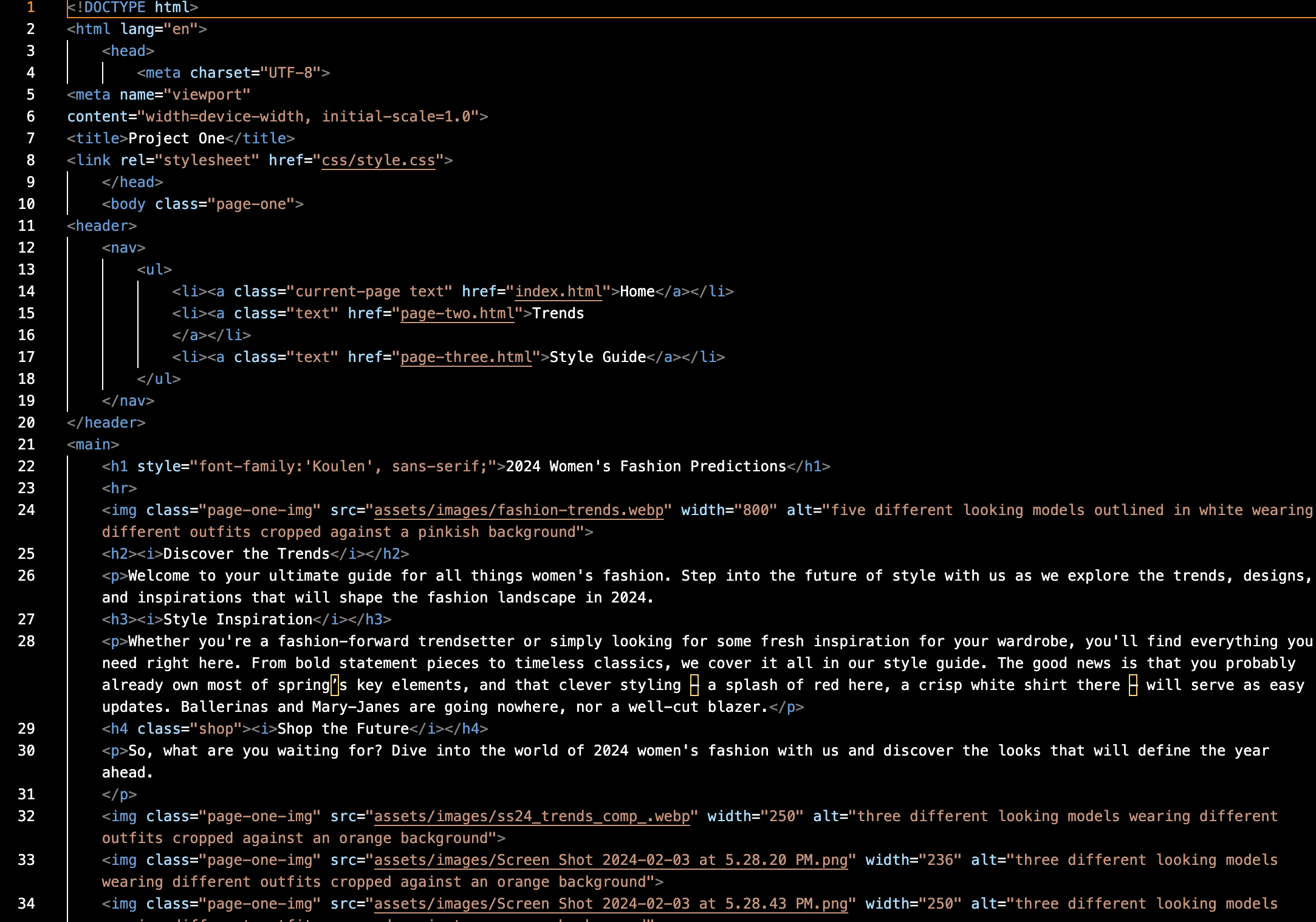
I wanted to keep the website simple, yet still look pleasing to the eye. I didn’t run into much trouble with my home page, besides the hover effect and background on the navigation bar.
Below is the CSS code for my navigation bar:
.text:hover{
    background-color:#D2042D;
    padding: 10px;
    object-fit: contain;
    border-radius: 10px;
    color:honeydew;
    font-weight: bold;
}

header{
    background-color:#ffbe98;
    padding: 15px
}

ul{
    list-style-type: none;
    margin: 0;
    padding: 0;
    text-align:left;
    font-size: 15px;
}

li{
    display: inline;
    margin-right: 10px;
}
My second page was my least difficult. This is where I focused on margins, padding, and image sizing. I used the same CSS from my home page, like fonts and color, on this page as well.
With all these images of various sizes and proportions, I struggled for a long time to align them evenly in a way that didn’t look messy. My vision was similar to a pinterest board. I played with adjusting each individual image size, padding, and margins.
After problem shooting for what felt like forever, I landed on this CSS code:
.style-guide img {
    width: 150%;
    max-width: 250px;
    height: 300px;
    object-fit: cover;
    border-radius: 10px;
    padding: 5px;
  }
Things I Learned:
I learned a lot, but here are the highlights
- Lots of patience when I kept running into coding errors and had to go back through my code line by line to see where I went wrong.
- Styling text with hover effects, fonts, sizing, and colors to take a webpage from boring to interesting.
- The importance of the CSS box model like padding and margins when adding various elements like images and texts.