
<- Back to Web Development Projects
Speculative Redesign
A remake of Suzanne Collins’s official website.
Project Overview
For my final project, I chose to do a speculative redesign of Suzanne Collins’s official website using WordPress. I chose to do this project because I knew I wanted to redesign an existing site, and I felt WordPress had the most features for me to use in order to make it look how I wanted to. For my previous WordPress project, I feel as if I didn’t use it to its full capability, and I wanted to continue to enhance my skills. My goal for this speculative redesign is to create a more visually-appealing, user experience. Suzanne Collins’s website has outdated typography and colors, with no layout or organization for its content.
Challenges I Faced:
- The theme was my greatest obstacle: My favorite feature is the moving site title across the top of the page; however, the color was set on the theme’s CSS – something I could not fix. The color was inverted to the style you picked, and it would appear almost x-ray like across the image of Suzanne. tried using my own additional CSS and the inspect tool to see if I could change it on my end, but nothing worked. I still didn’t figure it out, but instead, I found a color that matched my website and fixed the x-ray issue.
- I realized how important templates and patterns are throughout full site editing. I wanted to give each of my pages a specific look in regards to the navigation bar and headers. However, every time I’d try to edit the page template header, it would end up changing the home page header as well. This is where I discovered the beauty of specific page templates. I created a page template for each page with its own unique header, bolding the page link of the current page.
- WordPress has a lot of great features, but it’s not easy to place your content exactly where you want to, especially when your theme has default margins and padding. The images were the biggest pain to work with in terms of cropping and spacing. Every time I placed my blocks, it would default to being as wide as the screen will go. I began getting in the habit of playing with columns and groups to adjust margin and padding accordingly, more than I had in my previous project. I most likely could’ve adjusted the default settings in my theme, but I didn’t want it applied to every block.
Let’s walk through the process
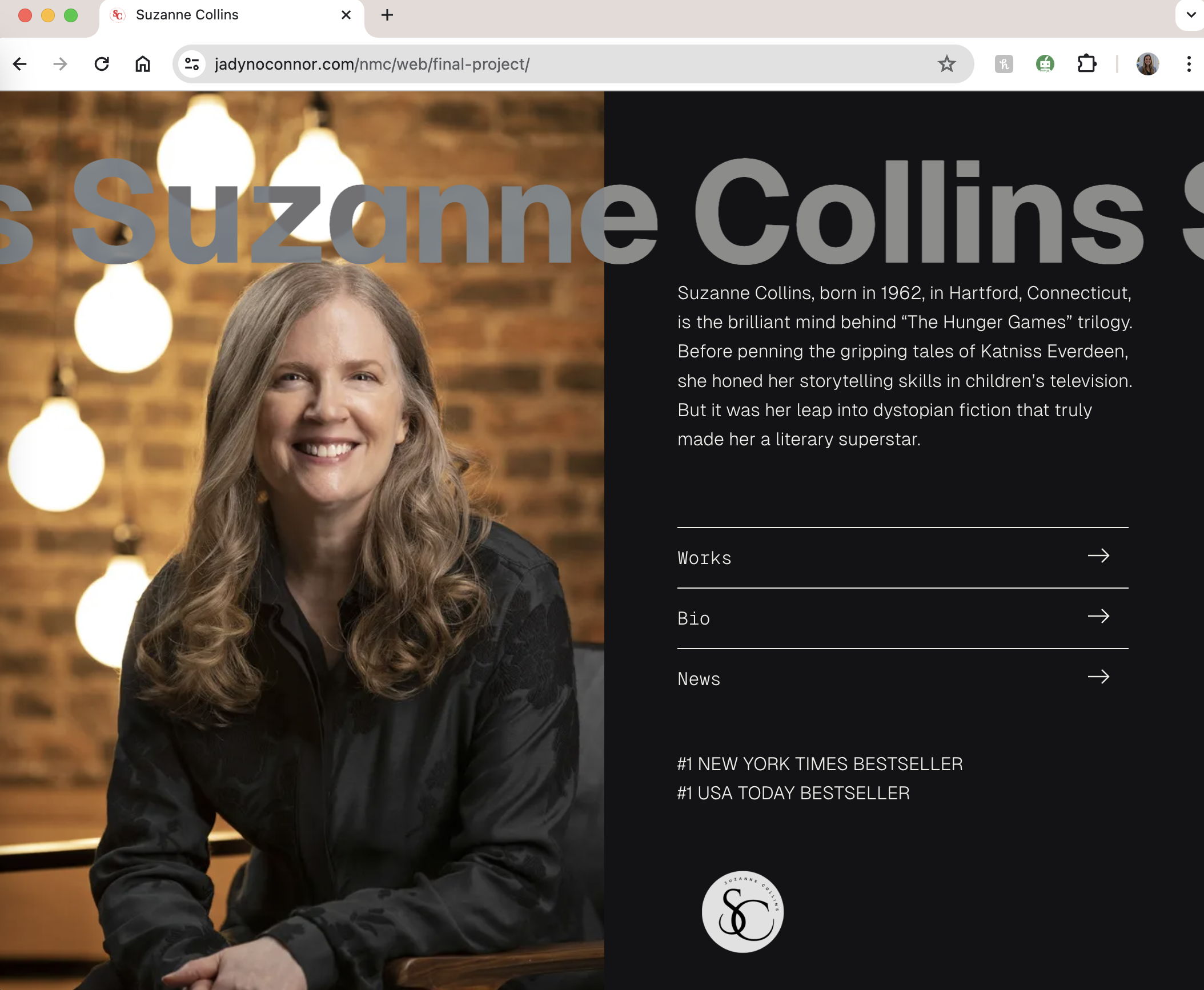
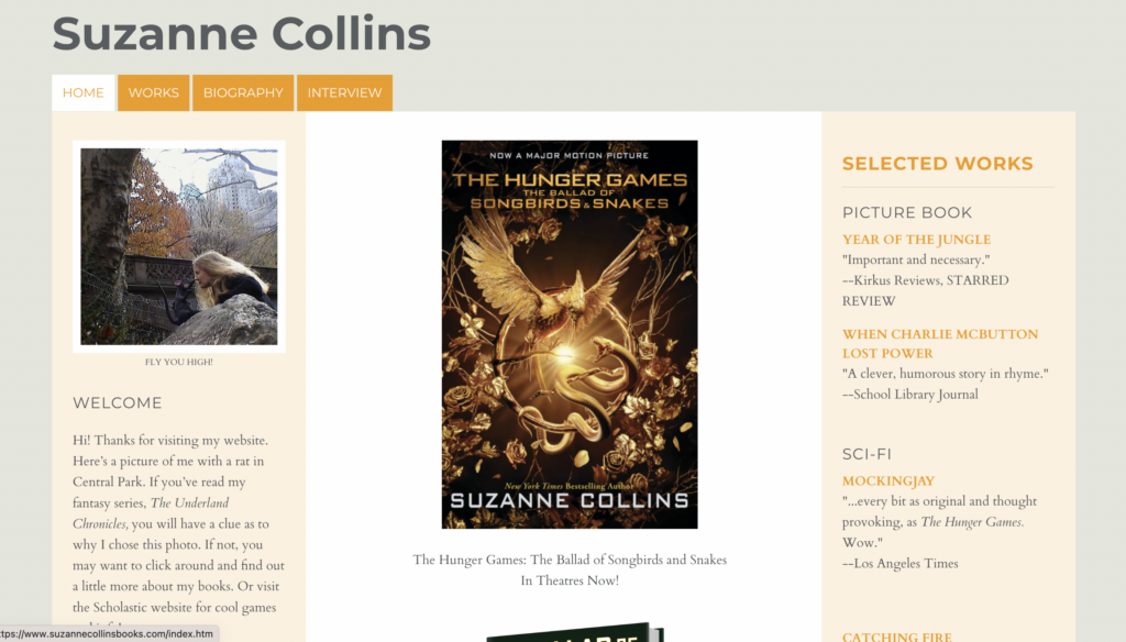
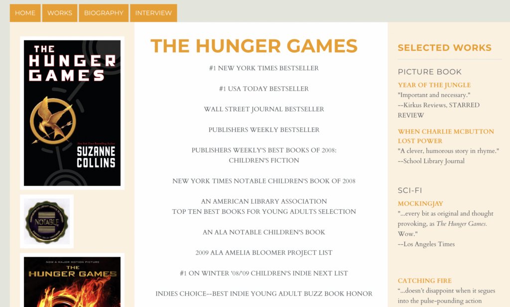
This is Suzanne’s homepage, and it feels very cluttered. There’s a column on the left with a welcome blurb, the middle column has content related to her most recent work but it’s just a long list of all its awards and reviews with no structure, and the right column has reviews for all of her works.
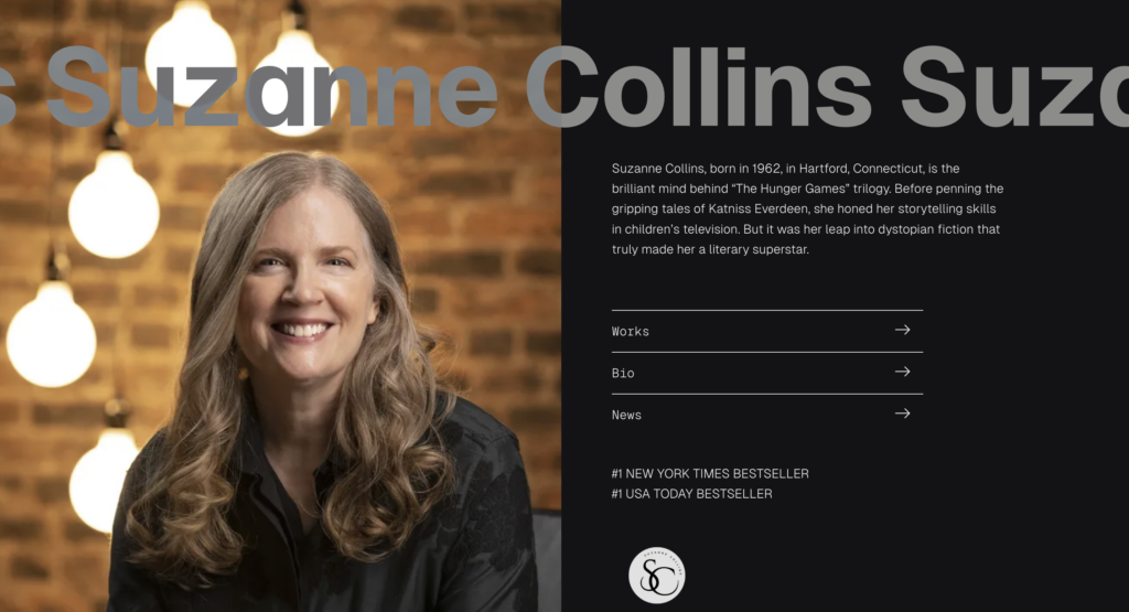
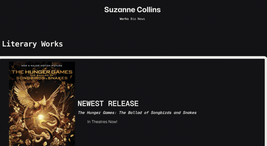
I used the theme Vermeer by Anders Norén.. For the homepage redesign, I wanted to focus on a clean and cohesive layout. The title has an animation that continuously moves across the screen. I included a short synopsis on who Suzanne Collins is, in case someone didn’t know when they found the website, and three quick page links to her works, biography, and news. Because I still wanted to add key points of her content from her site, I included those two honors on the homepage at the bottom. I also included a site logo I made on Canva because I feel every author should have one of those.
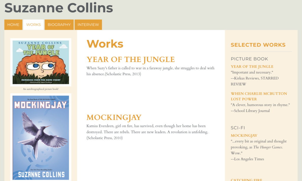
This is her works page, where she has all of her publications listed and linked to their own separate page. It is simple and basic. She doesn’t have her most recent work listed. Granted, it is on the homepage, but all the content is just laid out there without its own page.
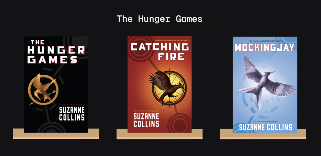
I displayed an announcement of her newest release since it came out not too long ago, and I have it linked to the post about the book. I had an idea for the works page to look as if the books were sitting on a bookshelf. I wasn’t sure how to tackle this, but I tried finding plugins that would let me place images on top of one another or something similar to that concept. WordPress has great features, but sometimes it isn’t always reliable with your big goals. I couldn’t figure it out, so I went to Canva and made each book look as if it were sitting on its own shelf. I did this for each of her books and organized them all in their own category: The Hunger Games, The Underland Chronicles, and Children’s. I’m really happy with how this turned out, even if it isn’t exactly what I had in mind.
I also worked with adding animations to all of my blocks. I used the plugin, Gutenberg Block Animations, and I added fade in effects as well as typing animations to my headers.
This is her page layout for each of her books. There isn’t a link to purchase, or any details about the book besides the various reviews and lengthy awards list.
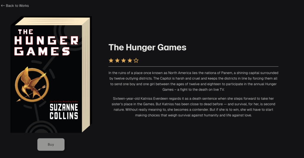
The book pages are where I wanted to add more fun elements that I felt Suzanne is missing. Each book page is a bit different than another as the different books had to have different information. I embedded YouTube videos for the books that had film adaptations, so the movie trailer was linked to view. I added Spotify playlists of the movie soundtracks, and I used a plugin where I could add a star rating, which reflects actual ratings I found on GoodReads. I included a buy button that takes you to the product listing on Amazon in a separate tab.