
Bootstrap Triptych
A three-paneled look at the same subject: a Lisbon travel guide created differently three times with Bootstrap components.
Project Overview
I learned Bootstrap in three different ways: Bootstrap components using HTML and CSS, a Bootstrap theme from BootstrapMade, and then personalizing the Bootstrap theme with additional CSS. The end result was a combination of everything I have learned throughout creating both panel one and panel two.
Challenges I Faced:
While I was still using what I learned from my first project (HTML and CSS), Bootstrap was still a whole new ballpark. With components like the grid system, there were new challenges that arose.
- When adding a background color for each container, I noticed it wasn’t filling up the entire page. I couldn’t figure out why until I asked for help, which we were then able to see that my carousel was essentially floating in space (it wasn’t a part of a container). Once that detail was fixed, my background worked properly.
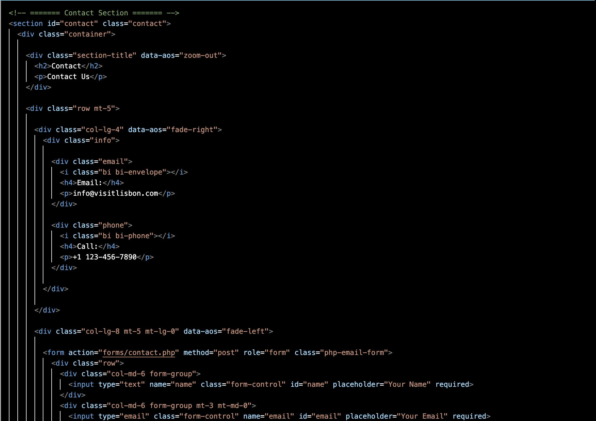
- When editing panel three’s custom CSS, there were certain section elements like Where to Stay that weren’t responding to my new changes – it was like my CSS couldn’t override the original style sheet. I used the inspect tool to see that my CSS was there, it was just crossed out. I moved the section elements higher up on my CSS sheet to see if it changed anything, which that seemed to do the trick. I assume it was so much lower on my sheet that the website couldn’t read it as important.
- In the beginning, I had a hard time grasping the grid system concept – containers, rows, and columns. With all the divs, I kept getting confused with what went where. I didn’t understand what col 12 meant or col 6 for example, and then, col-lg-12 or col-sm-6. I had to YouTube explanation videos to get a better understanding. But the more I played around with different columns and rows, I can proudly say I know what col 12 means.
What I’m Proud of:
I had the most fun creating this website, even if it wasn’t the easiest.
- Creating a responsive website essentially from scratch: while I did use Bootstrap components such as a navigation bar and carousel in panel one, I learned how to edit them to fit within the style of my webpage. In the beginning, I struggled with understanding the grid system, but once I was able to figure it out, I created sections with various rows and columns for my content that respond to different screen sizes – this I’m proud of.
- Even though this is only my second web dev project, I felt much more confident in both my HTML and CSS abilities and have extended on my current knowledge with newfound skills. Now with Bootstrap, I can incorporate more complex and personalized features within my web pages in the future.
- The functional components: Integrating functional components such as navigation bars and buttons seamlessly into my web pages. I was able to include interactive elements that enhance user experience. Throughout this entire process, I’ve had to pay close attention to detail as I shift and realign content accordingly. I had to ensure when I changed code that it was still responding correctly to fit the desired screen size.
Let’s walk through the process
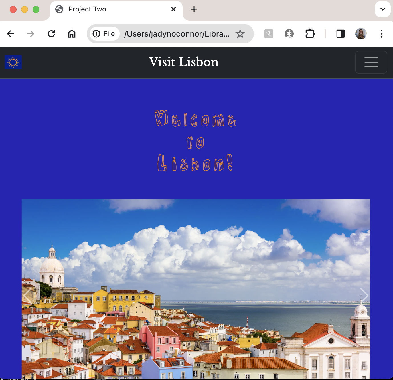
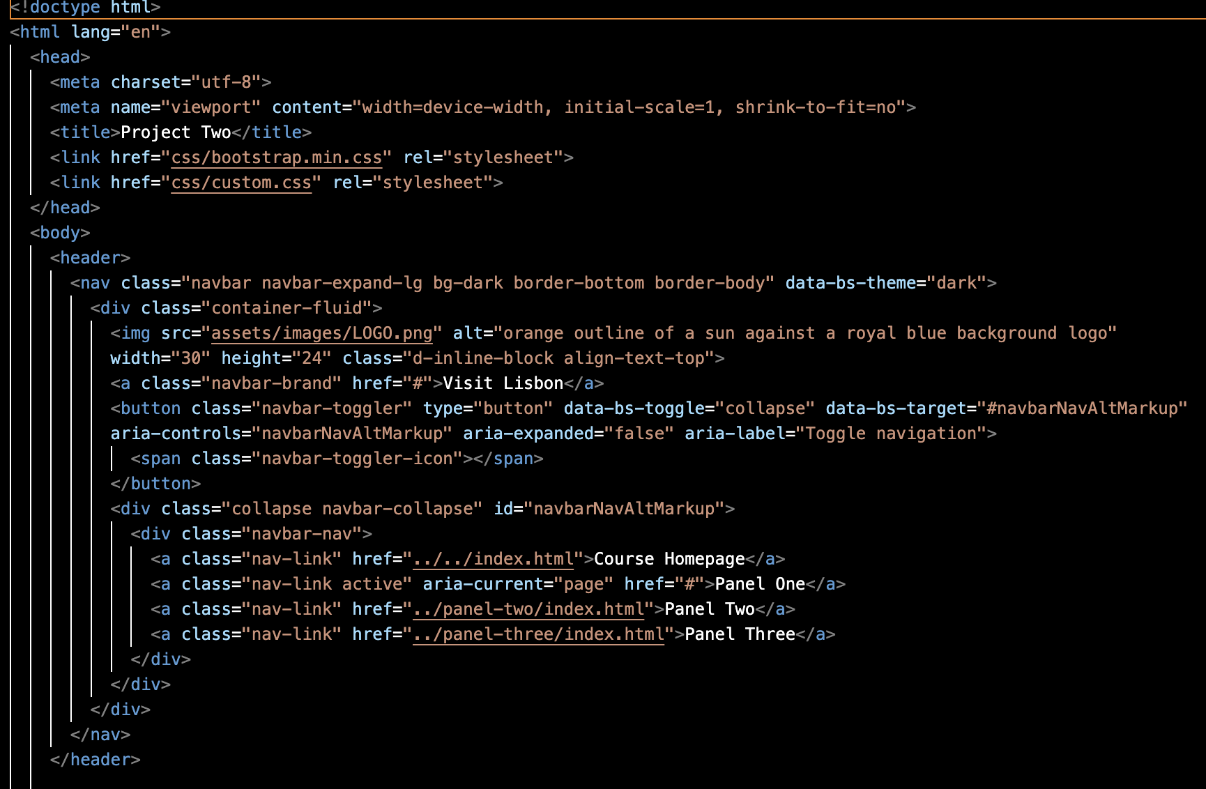
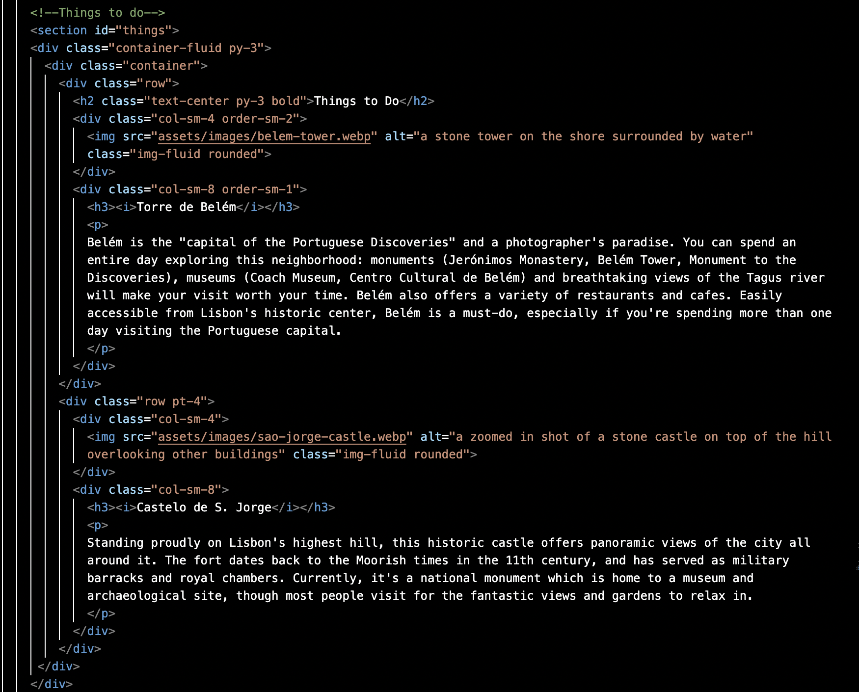
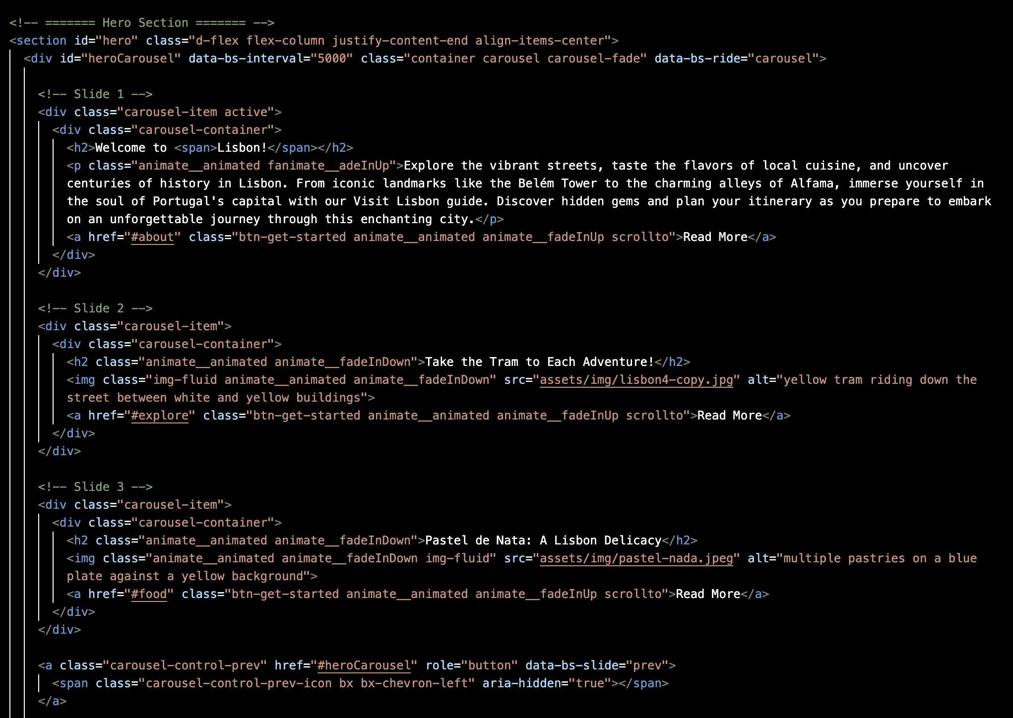
Panel One: Bootstrap components using HTML and CSS
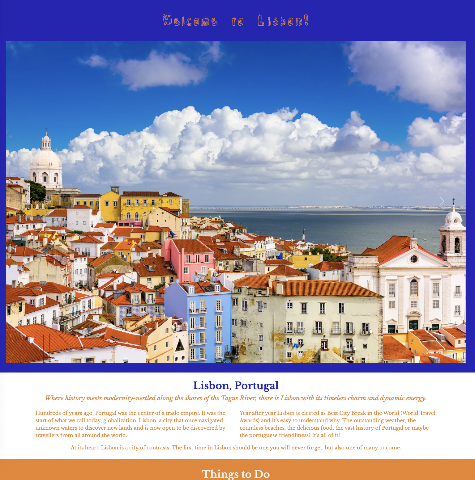
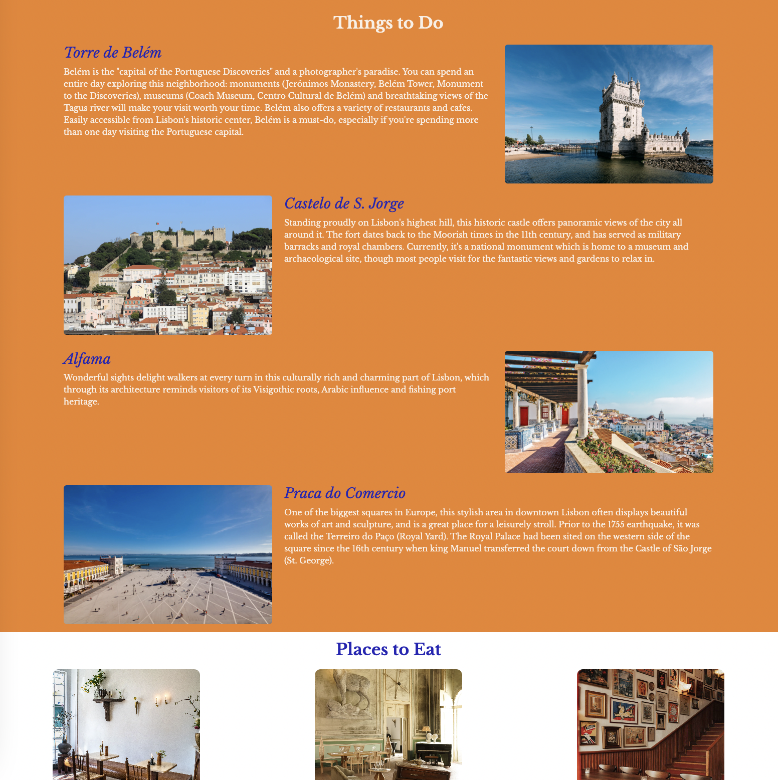
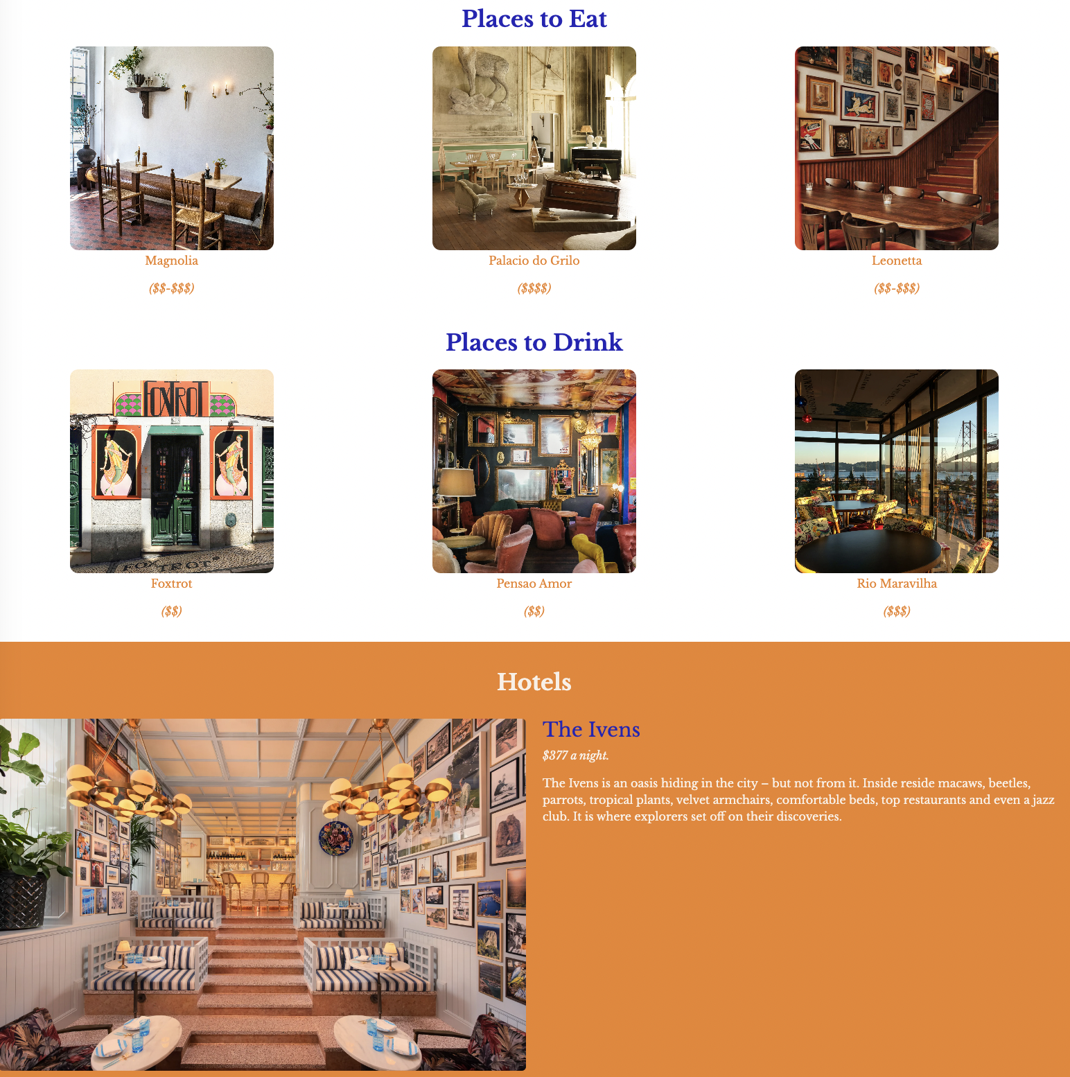
Panel one was all about getting familiar with creating a webpage from scratch using bootstrap components. I implemented the grid system: containers, rows, and columns, as well as a carousel and more complex navigation bar. My focus throughout this panel was learning how to achieve the layout and look I wanted, while also creating a responsive webpage. This panel took the longest because I didn’t understand the grid system, so I didn’t understand how to layout each section.
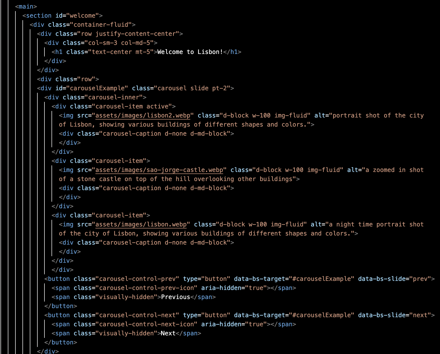
CSS code for carousel and navigation bar:
nav{
   font-family: 'Libre Baskerville', sans-serif;
   font-weight: 400;
}

#carouselExample .carousel-item img{
object-fit: cover;
object-position: center;
height: 70vh;
overflow: hidden;
display: flex;
padding: 30px;
}
Panel Two: Bootstrap Theme
For panel two, I took the same content from panel one and placed it in a theme I downloaded from BootstrapMade. I was only able to edit the content (HTML), of my template, but not the appearance (CSS). This panel was intended to visualize progress made from panel one to panel three.
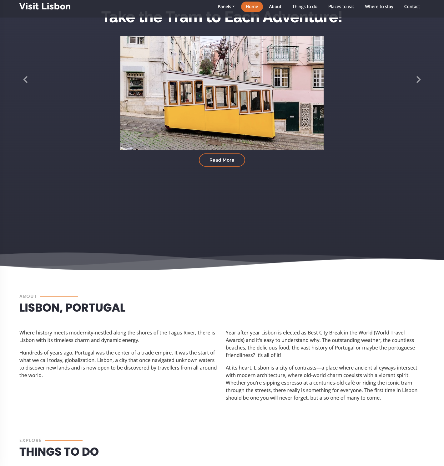
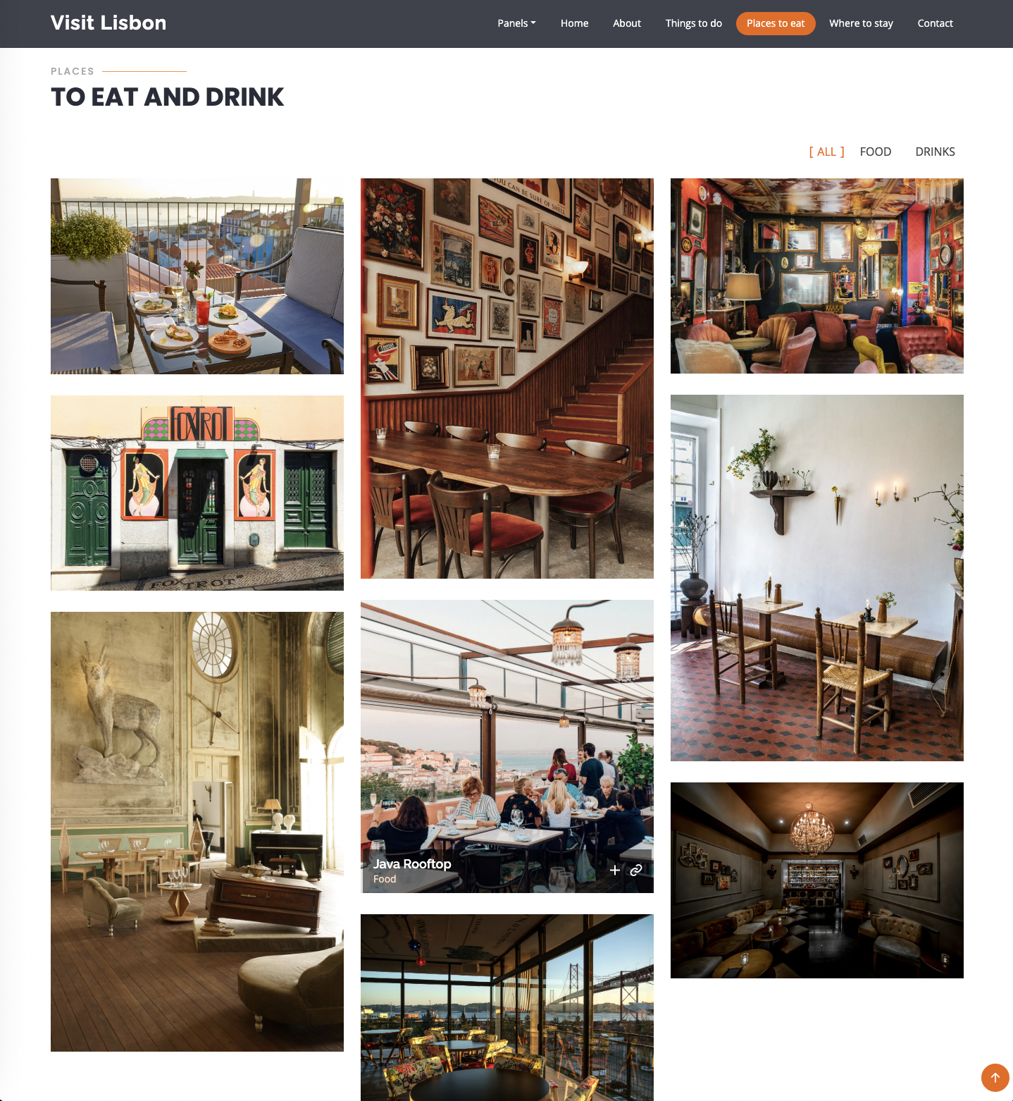
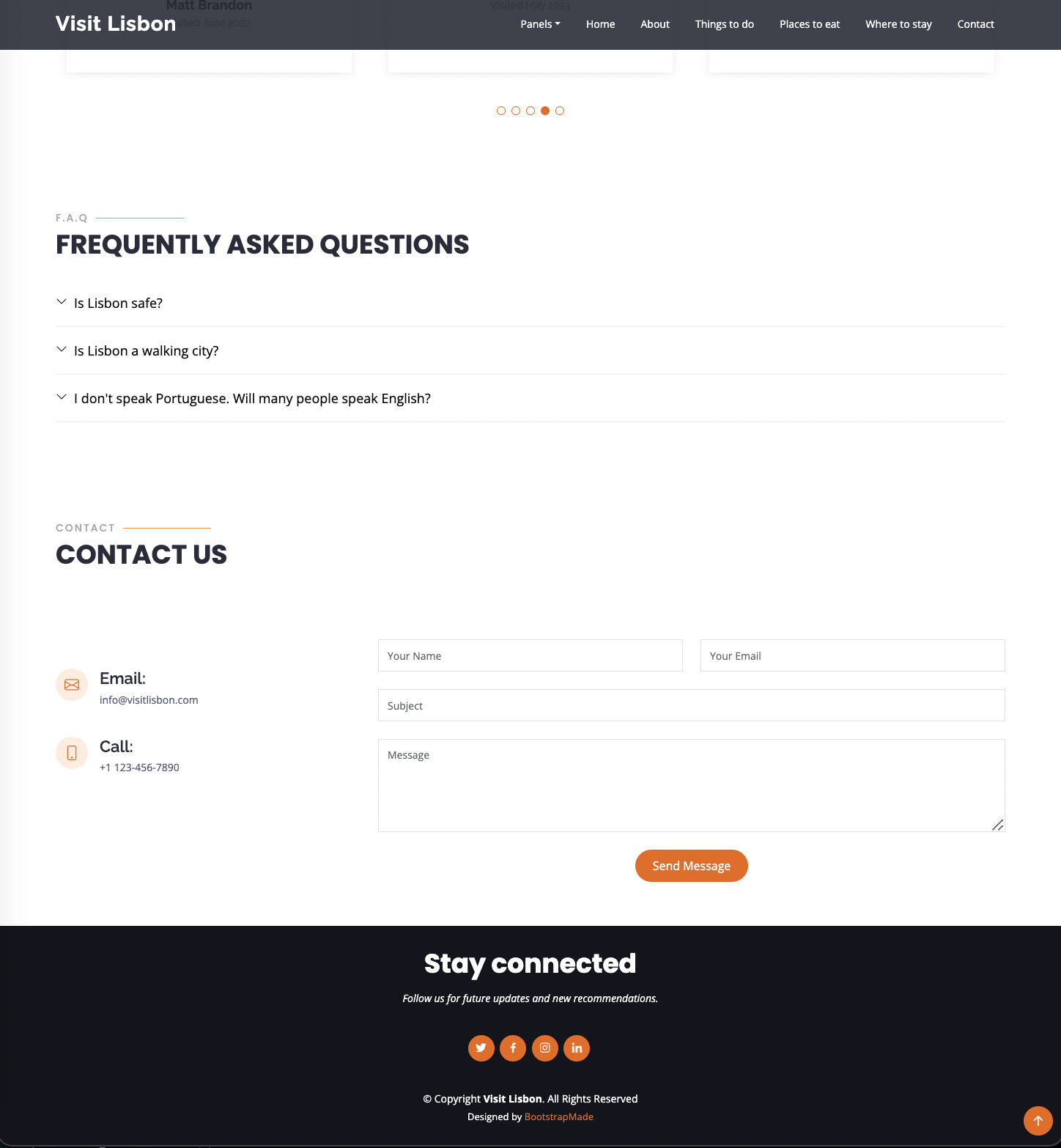
Panel Three: Bootstrap Theme and then some
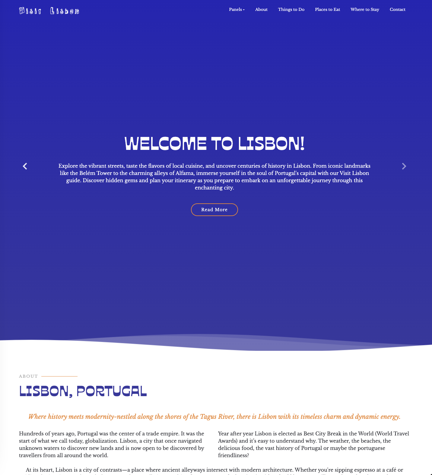
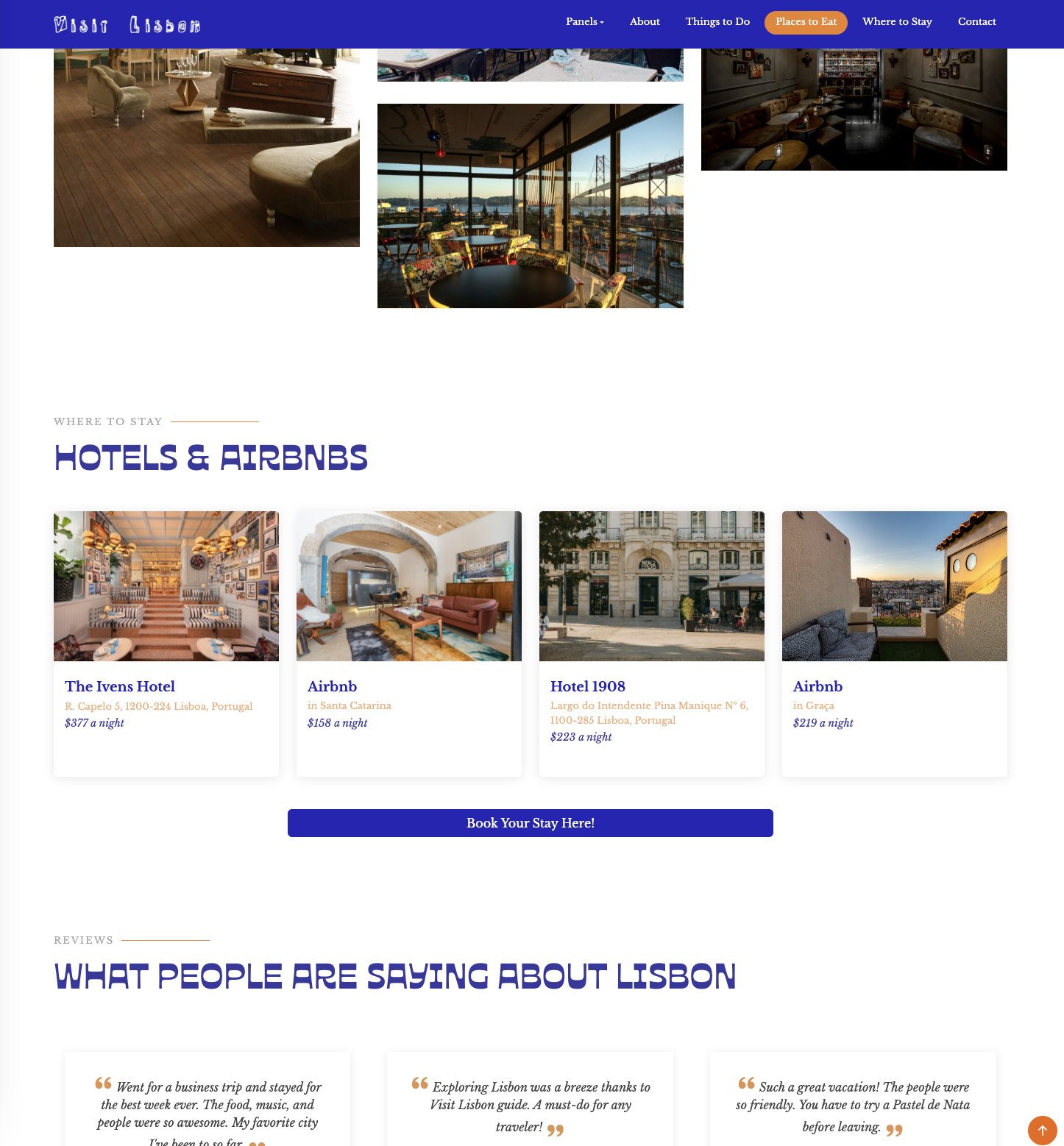
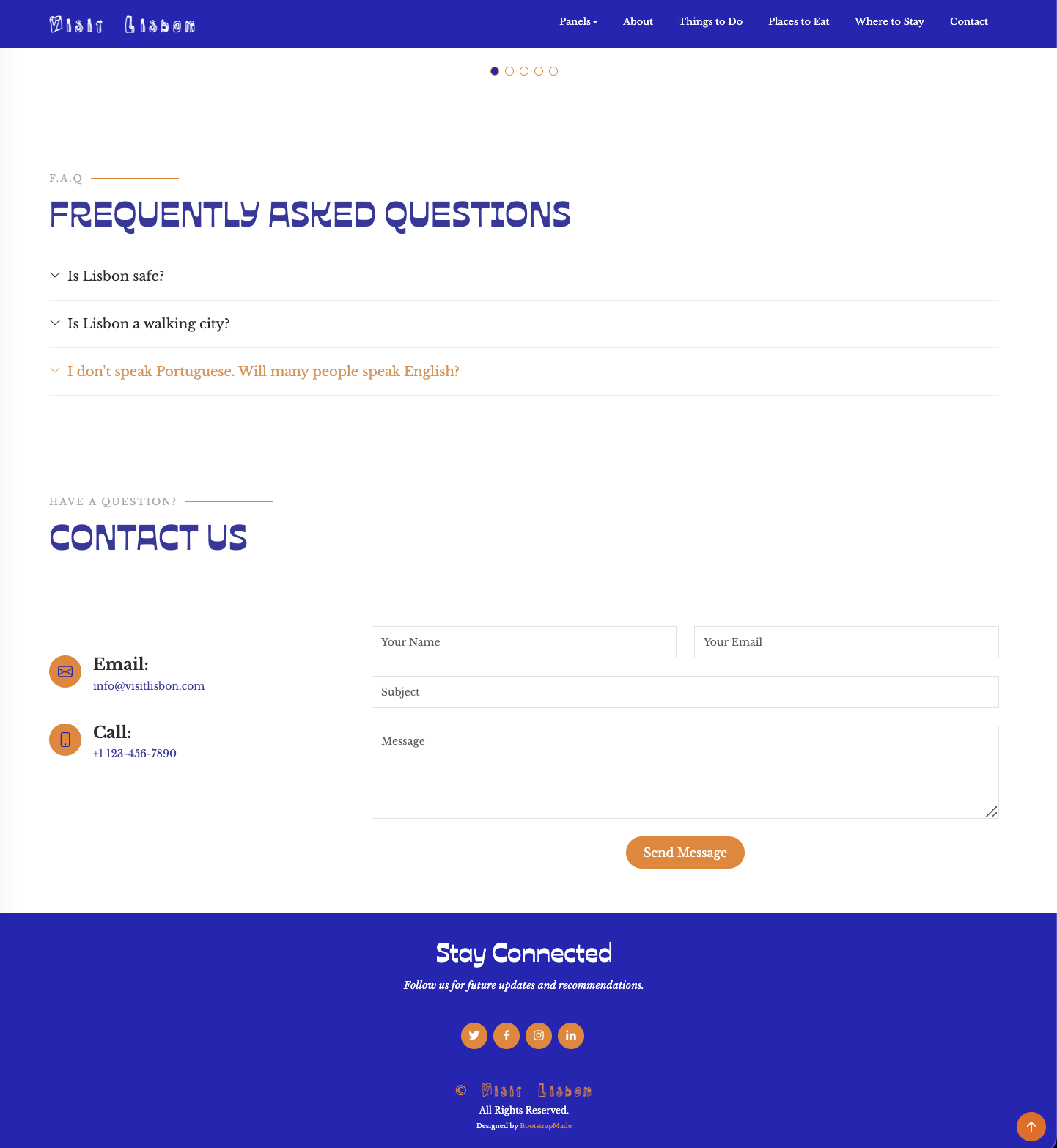
The final panel was about customizing the BootstrapMade template with custom CSS, from the colors to the fonts to the layouts. Luckily, I had found a template that fit my content perfectly, so I didn’t have to change too much about the layout. I really focused in on the colors, fonts, and other little details. Throughout working on this panel, I struggled overriding the template’s CSS, especially for the “Where to Stay” section. I had my CSS code in order of each section, from top of the page to the bottom; however, the “Where to Stay” section wasn’t responding because it was so far down on my CSS sheet. After moving the code higher up above the rest, it was able to override the original CSS.
The CSS code applied to the “Where to Stay” section (the name is from original template):
.team .member .member-info h4 {
  font-family: "Libre Baskerville", sans-serif;
  color: rgb(37, 37, 182);
}
.team .member .member-info p {
  color: rgb(56, 56, 159);
  font-family: "Libre Baskerville", sans-serif;
}
.team .member .member-info span{
  color: rgba(236, 131, 39, 0.633);
}

.btn-place{
  --bs-btn-color: #fff;
  --bs-btn-bg: rgb(37, 37, 182);
  --bs-btn-border-color: rgb(37, 37, 182);
  --bs-btn-hover-color: linen;
  --bs-btn-hover-bg: rgb(66, 66, 220);
  --bs-btn-hover-border-color: rgb(66, 66, 220);
  --bs-btn-focus-shadow-rgb: 49, 132, 253;
  --bs-btn-active-color: #linen;
  --bs-btn-active-bg: rgb(37, 37, 182);
  --bs-btn-active-border-color: rgb(37, 37, 182);
  --bs-btn-active-shadow: inset 0 3px 5px rgba(0, 0, 0, 0.125);
  --bs-btn-disabled-color: linen;
  --bs-btn-disabled-bg: #0d6efd;
  --bs-btn-disabled-border-color: #0d6efd;
}
Before
After
Things I Learned:
- Responsive design principles: with Bootstrap, we took what we learned from project one (basics of HTML and CSS) and combined it with Bootstrap to create a responsive website – websites that look and function well across different devices and screen sizes. This is where Bootstrap’s grid system came into use, creating flexible layouts that adapt easily.
- Bootstrap’s specific HTML structure: it still includes semantics like head, body, main, and footer, but now we use divs to create sections, containers, rows, and columns amongst other elements. This helps keep each section’s content orderly and aligned on the webpage.
- Because we are working with so many divs in Bootstrap, the content begins to blur together. I learned utilizing sections and using id to label each section. This is especially helpful when using CSS to edit specific elements, like h1 for example. I don’t always have to create classes but can instead use the id function to change that specific h1 element without changing any others.